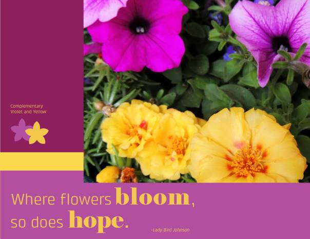
Description: Take an original picture, edit in Photoshop, and use the color scheme to add design elements and words to the image.
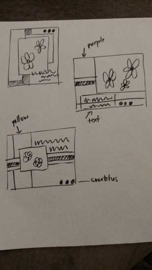
Sketches:
Process (Programs, Tools, Skills, FOCUS principles): To begin this project I though about a poster that my daughter might like in her room. Her favorite color is purple, so I decided a complementary color scheme using purple would be a good way to go.
I photographed some flowers I have on my porch and tried to place flowers on the “thirds” grid lines.
Once I had the picture in Photoshop I cropped, and adjusted levels, vibrance, selective color and sharpening. Using InDesign I placed the image, added color blocks and text. Then I did a lot of moving elements to create alignment, asymmetrical balance, and hierarchy with my font choices.
Message: Gain hope from seeing beautiful nature around you.
Audience: My instructor and my daughter.
Critique Report: Instructor feedback suggested that I increase the size of my picture and maybe even have it bleed off the page. She also suggested that I work with the quote more so that the word HOPE didn’t look so lonely.
I also used the Facebook group and heard from Kathleen that it might be a good idea to layer my flower icon swatches. I really liked that idea because I felt like it unified them into one design element. Sister Kunz also suggested that maybe putting my quote attribution in italics would help it look better. I was concerned about the spacing around it.
I reviewed Karina’s second draft and thought maybe the picture should extend to all three edges to remove the very thin side borders.
Top Things Learned: to my typography and didn’t have to keep everything black and white.
Color scheme and color names: Complementary color scheme- Violet and Yellow
Title Font Name & Category: Klint- Sans Serif
Copy Font Name & Category: Elephant- Modern
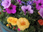
Thumbnails of any original, unedited image used in the project:
Video Presentation:

Your final project is beautiful! I love the way the flowers were aligned in you photo. The color scheme is excellent and I love the backgrounds you used around the photo; they make excellent frames for the photo. The quote inspired me too.
I ended up shrinking my photo and also putting borders around my photo, but handled is slightly differently. https://kirbyeibyui.wordpress.com/2016/05/19/5a-photo-design/
Justin Scott did good bordering as well, and was also awesome framing of his photo: https://justincomm130.wordpress.com/2016/05/18/photodesign-project/
LikeLike
This looks really awesome. I enjoyed the colors you picked out. This is nice that you did this for your daughter. I think you did a really good job and look forward to your work in the future. Here is my blog down below.
https://designersedgesite.wordpress.com/category/design/
LikeLike